
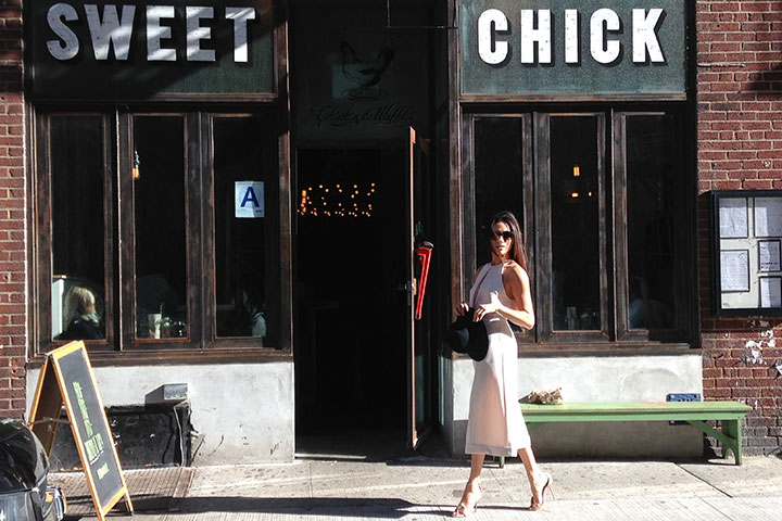
Kaelen Haworth’s eponymous line is so masterfully and fluidly designed (clock the look I rocked for this shoot), you’d assume that Kaelen has been around for decades. Believe it or not, Haworth only launched her brand in 2011. But don’t take that to mean that Haworth is green when it comes to the fashion world—prior to creating Kaelen, she honed her skills at some pretty fancy pants places, such as Jenni Kayne and Stella McCartney. The label now has the attention of Vogue and the CFDA, where Haworth has been selected into the prestigious CFDA Fashion Incubator development program, which means we’ll be seeing even more great things from this relatively new designer – a fact I am tickled pink by. #swoon
Tell us how you started your line, Kaelen.
I moved to NYC after graduating from college because I wanted to go to Parsons. While I was at Parsons, I interned at Stella McCartney, Jenni Kayne and The Lake and Stars and then after I graduated in 2011, I worked on getting my own collection started. I started with a very small capsule collection, but it took a lot of time. That was five years ago and here we are now! This is our eleventh season, actually.
What’s it like being a part of the CFDA Incubator?
We’ve been here since May and the program is two years, which is amazing. While we’re here, we have rotating lectures and workshops and there’s sort of an element of school about it. We also have mentors, all of whom have different areas of expertise, which is amazing because you kind of live in a bubble when you’re designing something, so it’s really great to have four people who are coming from it at all different angles. It’s really helpful; it already feels like we’ve had an immense amount of help just from being here for under a year. It’s really a game changer.
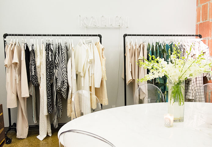
The Design Process
“For the spring collection, my starting point was something sort of floral but more minimal. Everything in the collection in general is feminine, but not super girly, so it was important to find that distinction. We started with an image of a floral that was very soft and had some curved edges and it wasn’t too girly or too frilly. From that, I arrived at the idea of having something minimal but botanical at the same time which is an interesting mix. The overall feeling I wanted to create was something very fresh and more textural and tonal, which is why we used fabrics like cotton fringe. We always use fabrics that are really distinctive and really different.”
The Fabrics
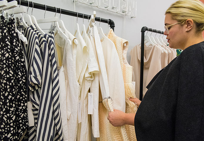
“This is from a mill in France that does really amazing, innovative stuff, but it still has a very traditional feel to it. That’s something that I come back to a lot—to have something that feels really innovative but also really traditional and that’s the basis for picking the fabrics. We ended up with this resin-coated linen, so linen is obviously something that’s quite the traditional fabric and then having it coated in resin makes it feel a little more modern and brings it up to date. Adding that coating to linen, which can be a little bit boring, makes it more interesting as well.”
The Fringe Dress
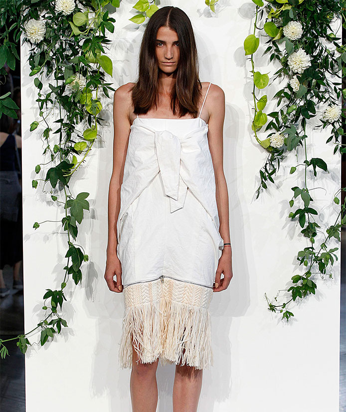
“I incorporated a lot of fringe into this collection, but it feels different from a lot of the other fringe that’s everywhere. This is a tie dress and it’s a little crazier, but it’s one of my favorite pieces. It’s not for the faint of heart.”
“A lot of these fringe pieces actually zip off, so there’s this convertible element that I started incorporating last year and I’ve been working that into the brand and into each of the collections. It totally changes this look drastically—once you remove the fringe, it’s a different world and different look. I’ve always used the hardware element because I like that it’s something bright and industrial looking. I decided to use the zipper this way because I don’t want to just put something on my clothing if it isn’t functional.”
The Striped Top and Culottes
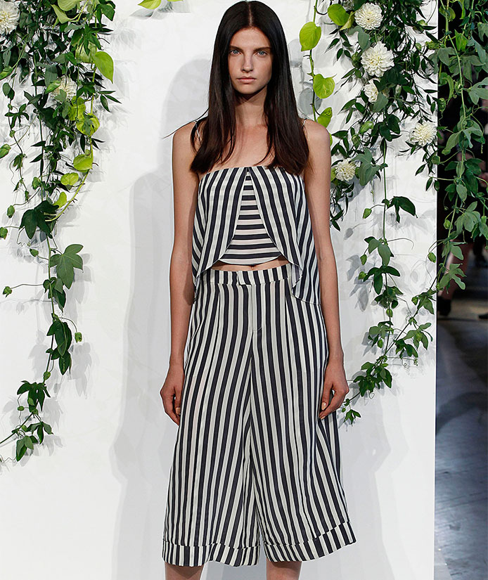
“I always do a graphic element of some sort and stripes are perfect because they’re like a non-print print idea—they’re still something that people react to. It’s graphic, but it’s not too striking. You still have to be wary of where that perfect stripe is and it becomes a whole different stand out category.”
“This is the perfect stripe because it’s not so sharp—the fabric is a little softer and the actual colors are not graphic black and white or even graphic navy and white. These colors have a softness to them, which I really like. It works back to the softness of the collection, but it added that graphic element which could have been missing. It was really great with this pink nude tone, which makes the stripe feel more every day, which felt like it was important.”
Images via: Judy Meepos, Style.com